brand evolution vs brand revolution blog thumbnail

Brand Evolution vs. Brand Revolution: Making the Right Decision for your Rebrand

Share

As customer needs and desires change, it’s only fitting that brands grow to meet them. That change can appear in product lines, customer service, or even the branding itself. Updating a brand’s look and feel can recapture your audience’s imagination while giving your organization a revitalizing boost — from logos to color palettes to writing styles.

In the last few years, many brands have updated their look in response to the myriad of changes to their industries left by the pandemic. A Hanover Research study found that about 75% of companies did work to their brands from 2020 to 2021. In the same study, researchers uncovered the top reasons marketers made updates to their brands, including: to increase customer satisfaction, optimize brand messaging, improve market share, and improve their competitive market position.

Forbes boiled rebrand motivations down to two categories: needs and opportunities. Some businesses need to rebrand because of mergers, reputation crises, and competitive influences. Other brands rebrand to seize an opportunity for corporate growth, product and service promotion, or other meaningful corporate changes.

No matter the reason, when a brand knows it’s time for change, there is one question that stands in the way: how significant should that change be?

Evolution vs. Revolution

coca-cola logo design over time
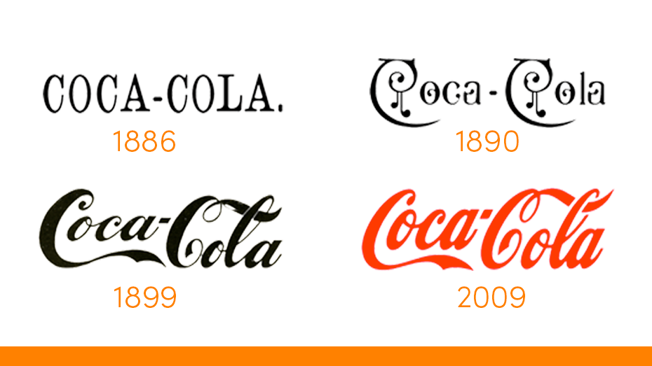
Brands can go for a Brand Evolution, a revamp of what their identity is already. This brand refresh meant to be a natural and recognizable growth of a brand. It’s less about starting from scratch and more about refining a brand’s existing collateral to stay relevant for the day’s interests and sensibilities. Using the logo evolution of Coca-Cola for example, one can see how the brand’s origin and history inspired each new visual iteration of the brand.

Or brands can go for a Brand Revolution — a complete rebranding. Rather than making small adjustments to a brand identity to fit with the changing environment, organizations can overhaul what they have into something completely new. One example: when the parent company Facebook rebranded as the all-encompassing, virtual-reality-focused Meta. Here, in-depth research propels the brand into uncharted territory, ensuring the revolution aligns with emerging paradigms and anticipates future trends.

Facebook logo redesigned to Meta

Ultimately, whether evolution or revolution, the success of a rebrand lies in the depth of research undertaken. Marketers must meticulously analyze data, interpret cultural shifts, and forecast market trajectories to make informed decisions that will propel their brand forward, be it through a gradual evolution or a transformative revolution. In the dynamic landscape of branding, research becomes the cornerstone upon which the foundation of a brand’s future is built.

Making the Decision

The significance of a rebrand, and what changes it might entail, should depend on insights about a brand’s target audience gleaned from thorough market research.

Before reimagining what a brand can be, marketers should seek to understand their audience. What do their audiences value? What sparks their interest? What matters to them? Any change made to a brand should reflect the needs and desires of the audience.

From there, a brand should set goals. Are they trying to retain repeat customers? Or maybe they are looking to tap into a brand-new market?

Evolution + Revolution Success Stories.

Every brand’s story of change is one-of-a-kind. (matter) has helped clients through brand evolutions and revolutions alike — from research to strategy to creative execution and beyond. Each case proposed unique problems that needed unique solutions. Here are five case studies of (matter)-led brand reimaginations, what challenges they faced, and what changes they employed.

Igloo Coolers

Background: Igloo Corporation was looking to update its identity and expand its line of hard and soft-sided coolers. A more contemporary logo that is successful whether printed, in-mold, or embroidered was desired.

Results: Research indicated the brand’s equities included the “hut” element and the lowercase “g” descender. We refined the typography and hut while also introducing a proprietary holding shape. These updates tested very well and helped position the brand for growth.

Igloo before and after logo

Kett Tool Company

Background: Since 1940, Kett Tool Company has built specialty power tools for professional contractors, builders, and craftspeople. Their logo was dated, difficult to reproduce and was in dire need of a refresh.

Results: After conducting stakeholder and customer research as well as a thorough landscape audit, we completely retooled the Kett brand and identity. Inspired by the function of many Kett Tools — precision cutting of metal, cement board and other materials — we crafted a bold, modern logo.

Kett Tool Company logo before and after

Beacon

Background: Through strategic acquisitions and expanded product offerings, Beacon Roofing Supply became one of the largest distributors of residential and commercial building materials across North America. They needed a logo and brand update.

Results: We created a comprehensive brand guidelines document and updated typography for their logo. We chose to maintain the lighthouse mark with slight modifications. The Beacon logo is paired with sub-brand descriptors for its various divisions and product lines.

Beacon Roofing Supply logo before and after

Kaivac

Background: Kaivac innovates solutions to help cleaning professionals achieve a better clean in an easier, more dignified manner than the traditional mop-and-bucket approach. Their brand and 25-year-old logo needed a cleanup of its own.

Results: Leveraging equities of their checkmark “V” and black and yellow color palette, (matter) designed a refreshed logo, identity and brand guidelines that now represent the science-based cleaning systems they deliver.

Kaivac logo before and after

Petmate

Background: Petmate, the worldwide leader of products in the pet industry, was looking for a refreshed logo to demonstrate their commitment of providing fun, quality products to enhance the lives of pets and their families.

Results: We retained select typographical equities but simplified the logo mark by removing the ball element. We incorporated a subtle heart shape within the P letterform and selected blue as the new brand color to evoke a sense of trust. We delivered options with and without a holding shape.

Petmate logo before and after

Brand Evolutions + Revolutions with (matter)

A rebrand can take on countless shapes and sizes depending on consumer insights on a target audience, changes to an industry, and a business’s goals. A reimagination can be a small evolution or a bold revolution.

For 23 years, (matter) had helped brands reimagine their look at feel. To see more rebranding case studies from (matter), visit our website. To learn about what (matter) can do for your brand, contact us for a consultation.