
How much attention do you pay to typography in branding? It turns out the average consumer finds fonts interesting, and your brand should too. Here’s a recent case study to illustrate: An online influencer went viral this year for her personification and portrayal of various font types.
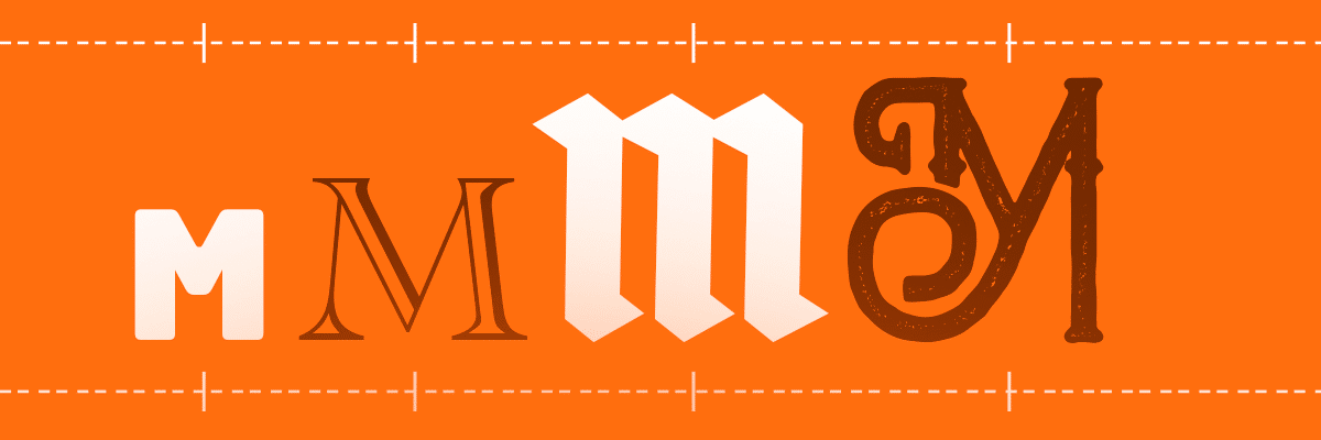
Garamond is quite academic, Futura and Arial commiserate over the absurdity of fonts with serifs, and Helvetica keeps a tight schedule alongside its tight kerning. While it may seem far-fetched to ascribe personalities to fonts, this humor is actually rooted in a very real branding truth: Good typography is the foundation of good design.
A Brief History of Typography
As far back as 20,000 B.C., cave paintings recorded the first written communication. Fast-forward to 3,500 B.C., when the Sumerians developed formal writing and modern typography began to take shape. In 1,000 B.C. the Phoenicians created an alphabet that took hold in Greece and Rome. With the invention of Gutenberg’s moveable type and printing press in the 15th century, modern typography was born. Individual letters were fabricated out of metal and set in a press, and a complete set of letters had to be made by hand for every different font size – a process which took a massive amount of work.
Typography remained virtually unchanged until the 1980s, when personal computers hit the market. Suddenly, typefaces were democratized, and designers could digitally develop and release new options in far less time. Computer-based typography design drastically lowered production costs and paved the way for the invention of more non-traditional fonts like Papyrus and Comic Sans. Thanks to centuries of innovation, modern companies now have unlimited access to a wide range of typographic styles, font families, and typefaces. This can be an extremely powerful tool for typography in branding – if you know how to use it.
The Web Revolution – And Its Challenges
The vast majority of today’s businesses have an online presence, which means these brands are working hard to catch consumer attention through relevant images, informative videos, and you guessed it: eye-catching typography. But what happens when typography in branding works against you instead of in your favor?
Typography plays an integral role in any website’s success, primarily because poorly executed typography can cause a whole host of problems. For example, overloading a landing page with too many fonts can be confusing. Large font file sizes can make pages slow to load and cause readers to click away. Unlike the fixed size of a printed page, web type must also be formatted for various browser widths and mobile screens. So how can brands overcome these hurdles and incorporate typography that helps far more than it hurts? Through the use of variable type fonts and responsive typography.
The Arrival (and Benefits) of Variable Type Fonts
Around 2016, the introduction of variable type fonts solved one of these key problems for designers. Unlike a static font that requires a different file for every variation (think Helvetica Bold, Helvetica Extra Bold, and Helvetica Light), variable type fonts contain all possible variations in a single file.
The fact that variable type fonts can be quickly and easily tailored to fit any brand’s style makes them the perfect fit for fast-paced creative teams. Additionally, variable type fonts with optical size options are ideal for creating greater expression within the wide range of digital sizes. This aptly named typography offers multiple benefits to designers:
- Smaller file sizes
- Easier animation
- Faster page loading
- Flexible design range
- Additional weight and style options
- Greater legibility and accessibility for readers
The second web-based typography challenge – formatting fonts for different screens and devices – was solved by responsive typography. The invention of responsive typography enables fonts to adapt to different screen sizes, ensuring readability no matter the device.
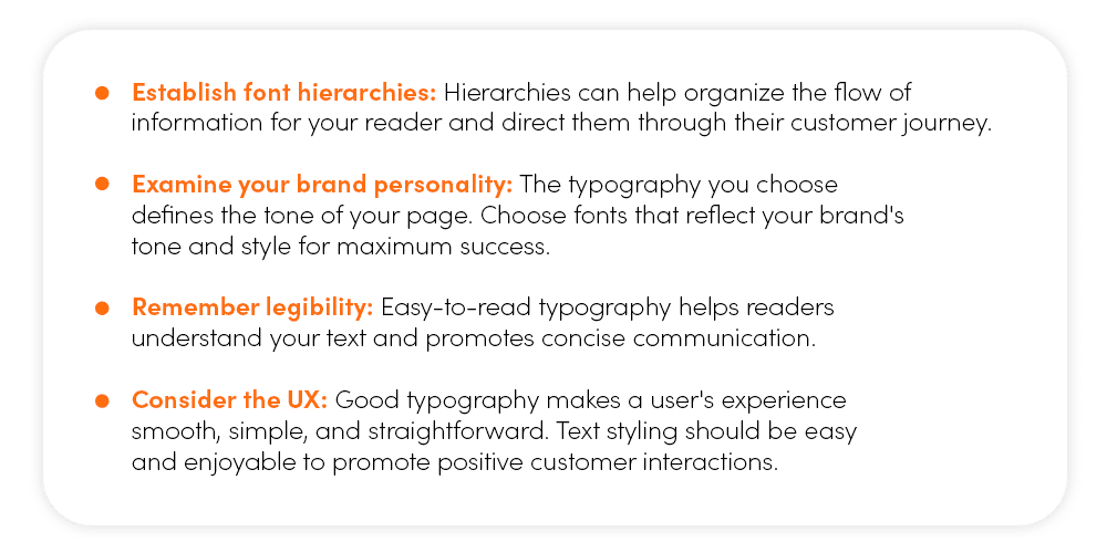
How To Choose Variable Type Fonts for Your Brand
Strategic type design is the foundation of good website performance, and choosing the right typography can create attractive, easy-to-read text that keeps people on your page and interested in your products. To truly grab, hold, and direct your audience’s attention, you need to pay close attention to the following key points:
Variable Type Fonts the (matter) Team Is Loving Right Now
Ready to explore the latest and greatest typefaces for your brand? Designers are pushing the variable type envelope in 2024, so if you’re looking to dive into contemporary typography, you’re in the right place. The (matter) team is currently loving variable typefaces for client projects because of their flexibility.
We’ve asked our top designers to give us the low-down on their absolute favorite variable type fonts and how those choices are helping clients reach their brand goals. As (matter) Co-Founder Joel Warneke notes, variable type fonts make it easy to dial in weights, compress or extend them as needed, and create a very consistent design. Here are our team’s current favorite fonts:
- Allotrope – This timeless sans-serif font has great personality with its squared appearance in the counterspace and stems. It’s a great alternative to more common sans serif fonts like Helvetica, Avenir, or Lato when you need easy legibility and want a little more style.
- Roc Grotesk – Another sans serif font that has tons of personality, Roc Grotesk feels modern and contemporary. The long terminals and ascenders on the lowercase letterforms are graphic and distinctive, and when you increase the weight of the font, the counterspace becomes thin and minimal.
- Tiffin – Need a highly sophisticated serif font that’s extremely legible and has beautiful ligatures? Tiffin lets you flow a large amount of body copy with high readability. The tails of the “j,” “f,” and “a” letterforms are very pronounced and elegant.
Sprinkle a Little (matter) Expertise into Your Branded Typography
If strategically choosing and implementing typography in branding seems like an overly complex process, our support and guidance is only a click away. The (matter) team has decades of collective experience developing type-forward designs for both print and web. Our digital creations are as legible and user-friendly as they are eye-catching and exciting. You can trust our designers to work from a solid foundation of knowledge. In short, we know what typography in branding will attract audiences and what will turn into a confusing design mess.
The designers at (matter) have firsthand experience in both web and print design. We constantly experiment with new technologies and explore new design developments. Curious about our past client projects and their results? Explore our portfolio of recent projects on our website before you contact us for your next design project. We’re ready to revitalize your brand’s online presence with visually stunning, user-friendly typography that delivers real results. Reach out today to get started!