
The Logo
“RISE” functions as the central rallying cry for the 2024 Beacon Leadership Summit. As such, the logo lockup is the most critical component of the visual identity of the event.
The logo should primarily be used on solid blue or a blue duotone image.
When using the logo on orange, the orange elements become white and the mountains become shades of blue.
When using the logo on white, the mountains become shades of blue.
Additionally, the logo may also be used on a full-color image as long as it retains its legibility and maintains appropriate clear space.

Getting the lay of the land
Once we had solidified the theme, we conducted a site visit at the Gaylord Texan Resort & Convention Center, where the summit would take place, walking through the venue and imagining how we could bring the event to life for participants, along with identifying areas that would need branding and directional signage. We immediately spotted an opportunity at the top of a set of long escalators that would bring attendees to the main conference room, and worked with a vendor to fabricate an oversized, dimensional version of the mountainscape in our logo. Standing over 10-feet tall, the piece provided not only a stunning surprise at the top of the escalators, but also an ideal selfie backdrop — confirmed by the many photos that were taken and posted on social media during the event.


Starting our ascent
In keeping with Beacon’s goal of inspiring their audience, we also created a series of eight-foot-tall rotating columns, dispersed around the conference center, that were lit from within and highlighted people from all industries and walks of life who had been motivated to “RISE” above expectations, including such figures as Katherine Johnson, one of the first Black women to work as a scientist at NASA, and Jim Abbott, who found success as a Major League Baseball pitcher despite having been born without a righthand. Together, the collection of stories created a compelling visual statement at the venue, while also promoting Beacon’s commitment to diversity, equity and inclusion.


Setting our sights a little higher
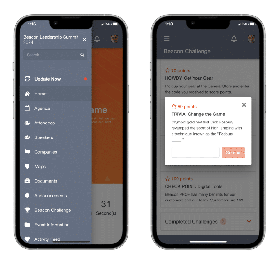
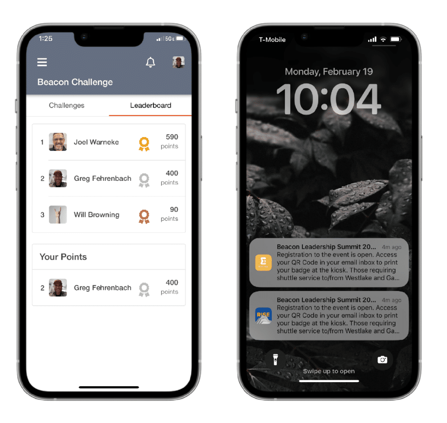
While attendees certainly engaged with the physical objects, Beacon also wanted to drive engagement with their conference app. In the past, the company had tried, unsuccessfully, to get participants to use the app to download the program schedule, access a map of the venue and, most importantly, communicate with each other. We know that there’s nothing that motivates action like a little healthy competition, so we created a daily trivia challenge that participants could only access within the app, challenging them to answer questions about the presentations, the RISE stories, and the company itself.
We also had fun hiding Texas-related items, such as a rubber rattlesnake and a cowboy hat, around the conference center; each item had its own QR code that participants could scan into the app to score additional points. Best of all, we posted leaderboards at multiple points around the venue, giving colleagues plenty of opportunities to cajole each other into playing. Not surprisingly, we were able to achieve nearly 100% app adoption by conference attendees, vastly outpacing any of the previous gatherings.

Taking in the view from the top
In addition to these initiatives, we also created hundreds of individual graphics for the event, from floor stickers and window clings to event maps, elevator graphics and more. We also collaborated with the audio-visual team running the main stage presentations, giving them PowerPoint templates, interstitial graphics and digital brand guidelines. It was a huge lift, but we’re proud that the Leap Group team could RISE to the challenge.

