Giving a Leader in Identity Verification Solutions a New Brand Identity of Its Own
With more than 25 years’ experience helping clients in high-risk industries prevent fraud and maintain regulatory compliance, EVS (Electronic Verification Systems) Solutions is a proven leader in digital identity verification services. But while its security technologies are best-in-class, its logo and website looked dated when they approached Leap Group for help. Our team did some background research of our own, then used that as the foundation to create a whole new identity for EVS.
Surveying the industry landscape
We started with a comprehensive industry audit, looking at messaging, positioning, products, services, and visual language. While many of EVS’ competitors had carefully crafted messages and positioning, it was clear that their capabilities were not on par with what EVS could offer its clients. Furthermore, EVS was a clear winner when it came to longevity, with a record of accomplishment proven out over decades while many other providers had quickly come and gone. The Leap team saw an opportunity for EVS to take advantage of its own core strengths and emphasize its deep industry expertise.
Conducting background research on our audience
A robust audience research initiative helped us refine our key targets (Chief Risk Officer, Chief Compliance Officer, VP of Product, and Software Engineer) and develop a comprehensive understanding of their goals, pain points, and motivators. We also researched each of the key industries EVS serves (Financial Services, Gaming, Age-Restricted Commerce, Retail & E-Commerce, Education, and Healthcare), exploring trends and opportunities in each sector. With all these insights, we created a new brand positioning for EVS that capitalized on its core strengths while differentiating it from the competition.
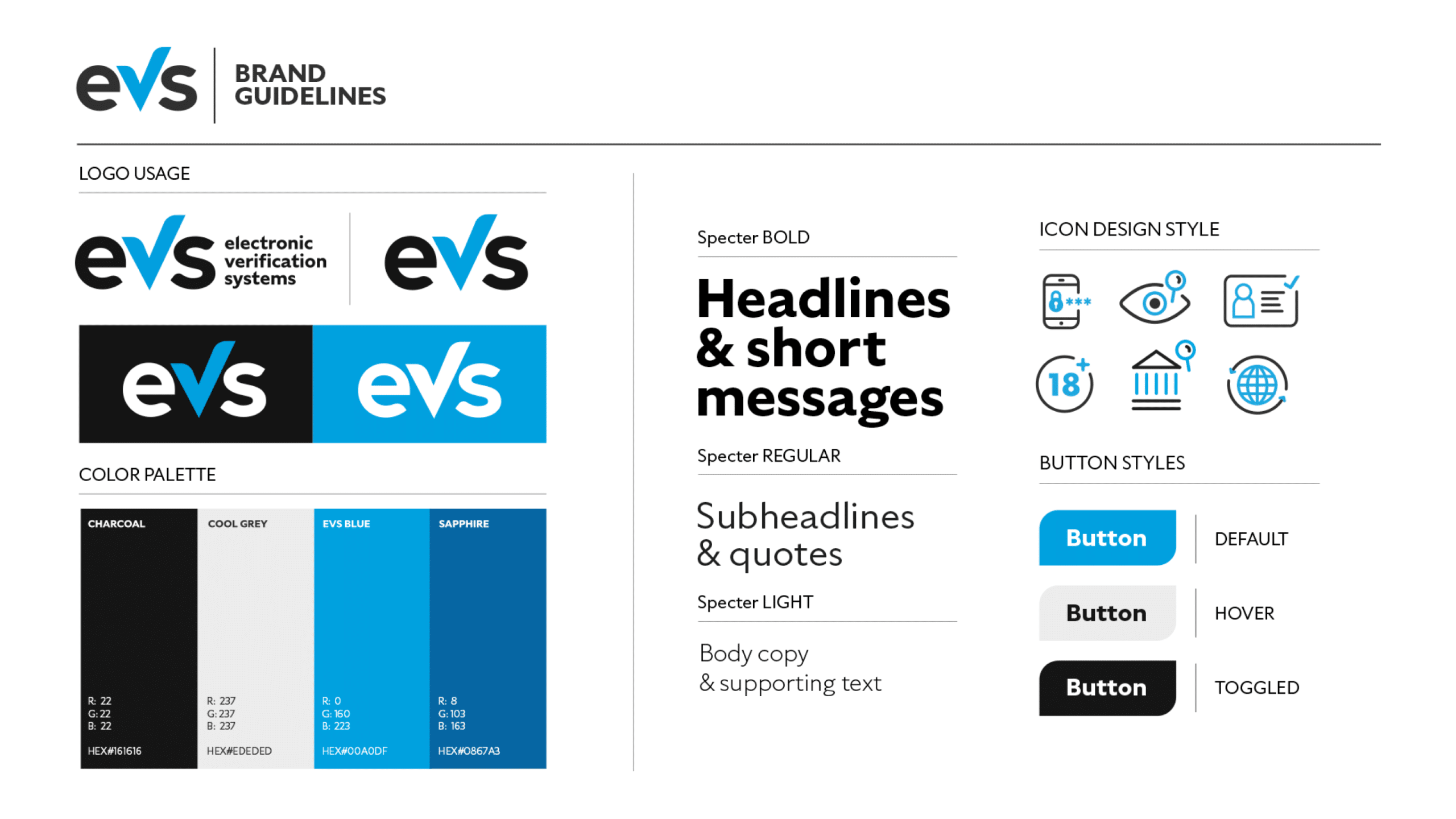
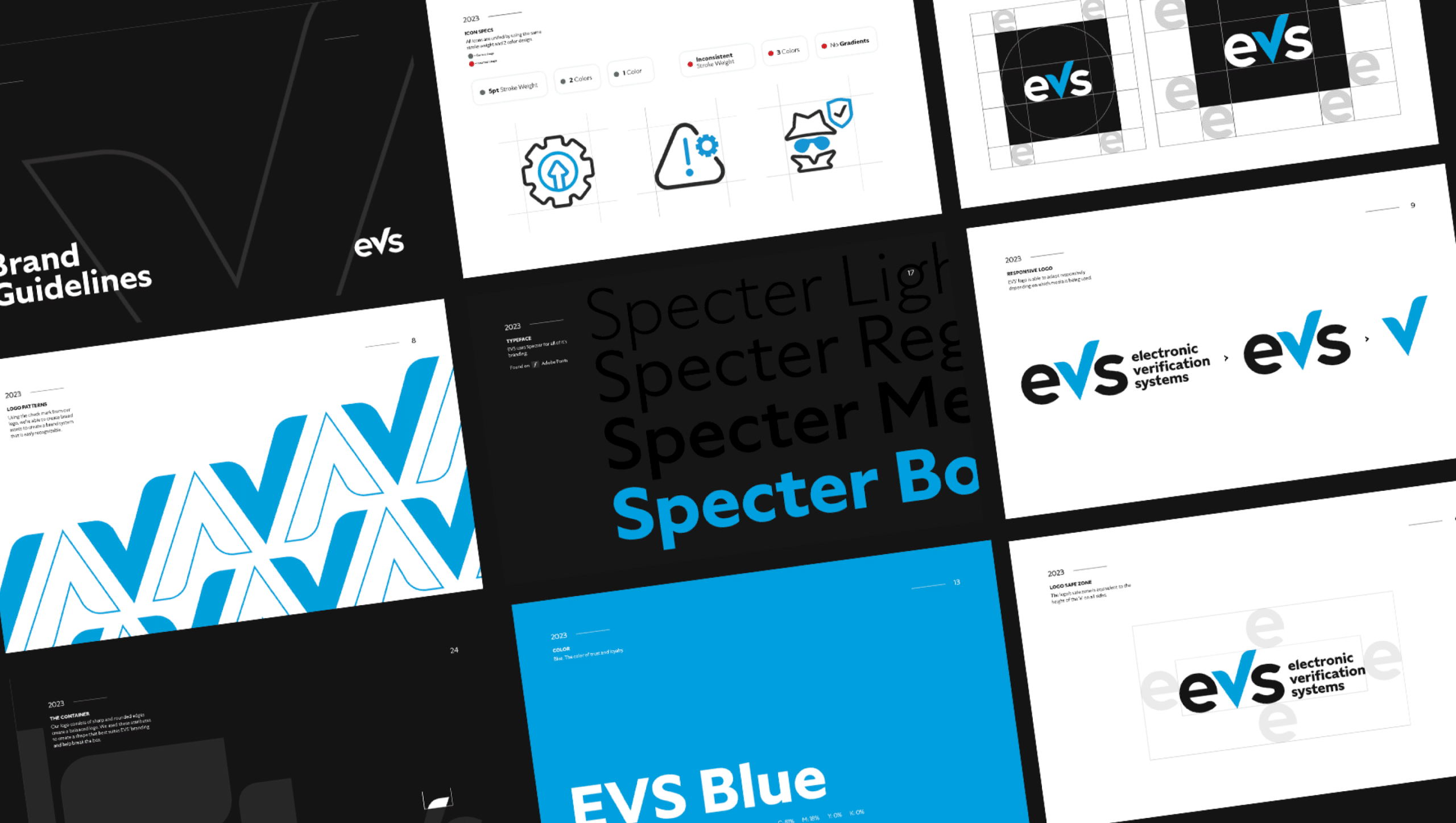
A modern logo for a tech-forward brand
Our next priority was a complete overhaul of EVS’ visual identity system, including its logo. The previous logo, with its blocky and hard-to-read all-caps styling, had been designed in the early 2000s—and it showed! The Leap team got to work sketching new concepts with a contemporary look and feel that reflected the company’s elevated level of innovation in its product offerings.
We landed on a lowercase design with a modern, sans-serif typeface that incorporated a check mark as the “v”—a unique graphic element that we carried through to boxes, backgrounds and other visual treatments on the website and collateral materials.
Before
After
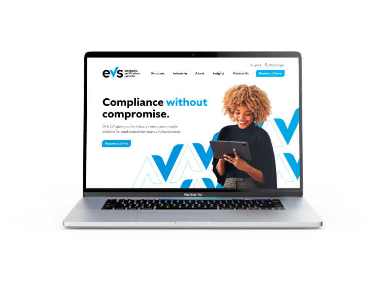
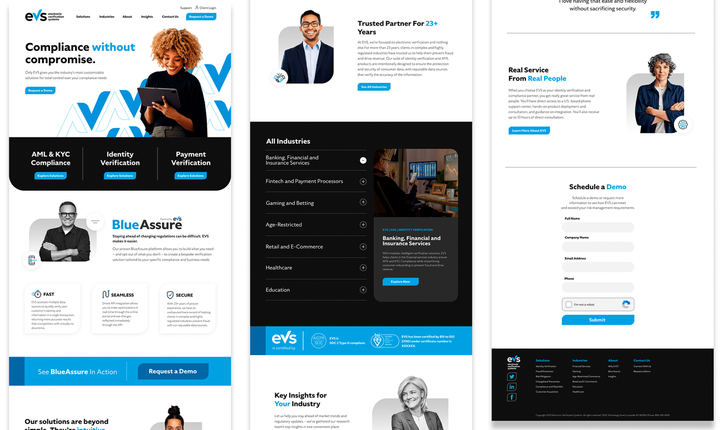
Putting it all together in a complete website overhaul
Using personas developed from our audience research, we redesigned nearly everything about the website structure, giving visitors in different industries with diverse needs clear paths to finding the information they needed (and leading them further down the conversion funnel at the same time). While EVS had no shortage of innovative products, we had to make it clear to potential customers that they were part of a complete suite of solutions, and all fully integrated with BlueAssure, the company’s intuitive, cloud-based SaaS platform.
From a branding perspective, we cleaned up the product nomenclature to emphasize they were all part of the same ecosystem. Then, we created a new site navigation that made it easy to find products based on business needs, such as customer acquisition and chargeback prevention. We also gave tech and security leaders across different quick access to solutions specific to their industries, saving them time and guesswork. Plus, we dedicated more space to messaging around BlueAssure and the streamlined architecture of the EVS product suite, as well as multiple opportunities across the site to schedule a demo.
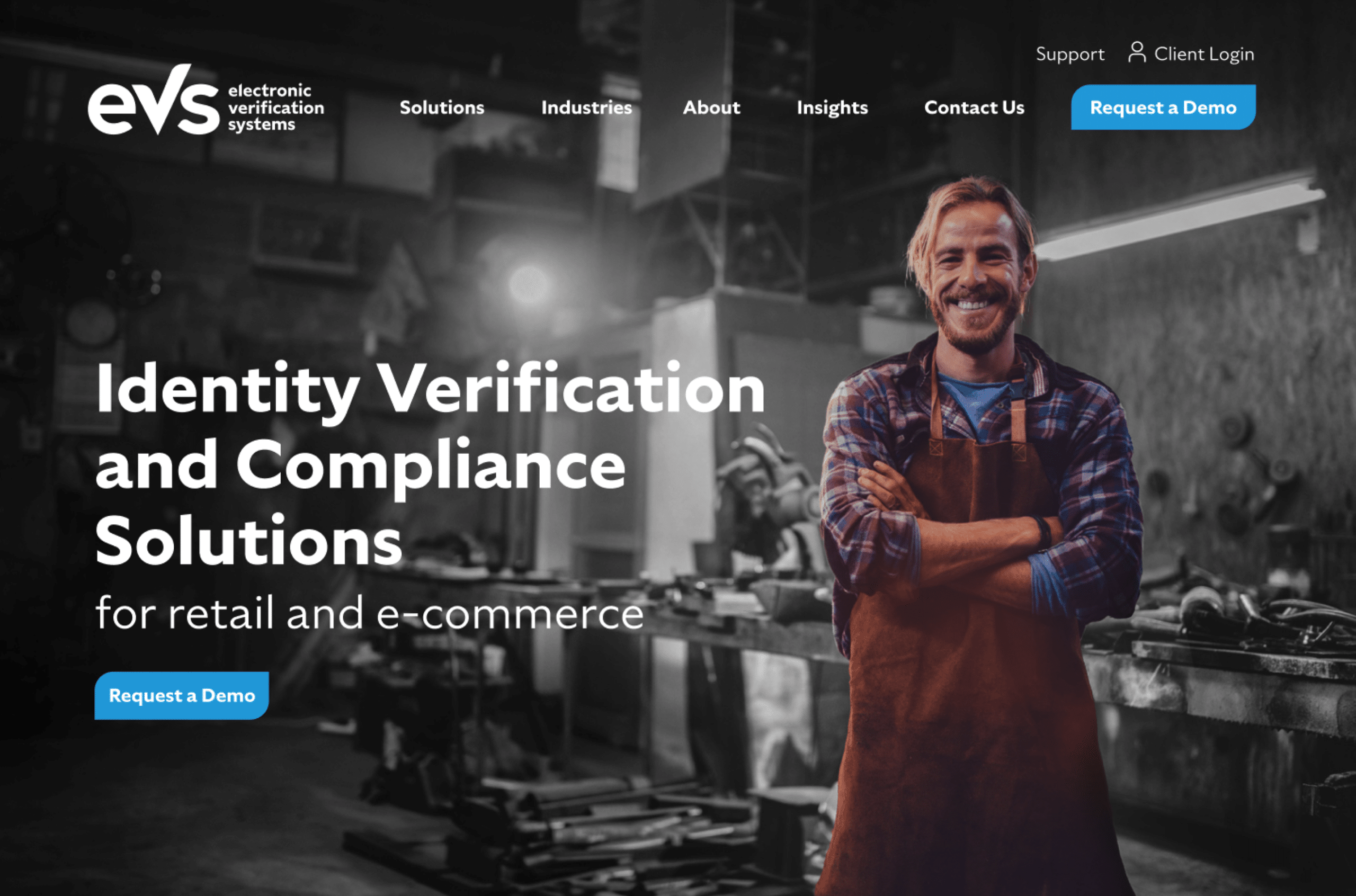
Adding human warmth and smart graphic elements
Once the new website structure was in place, our designers filled it out with warm, human-centered photography that matched the diversity and approachable personality of the brand. We showed trustworthy professionals in modern workplace settings and used natural lighting whenever possible, using black-and-white photography in places to create variety across the website. Finally, we developed icons and graphic elements in the brand’s color palette to add visual interest and convey the company’s modern, streamlined approach.
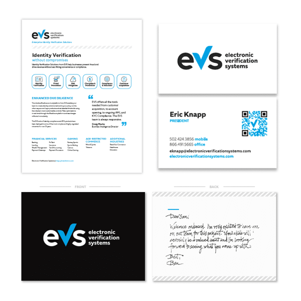
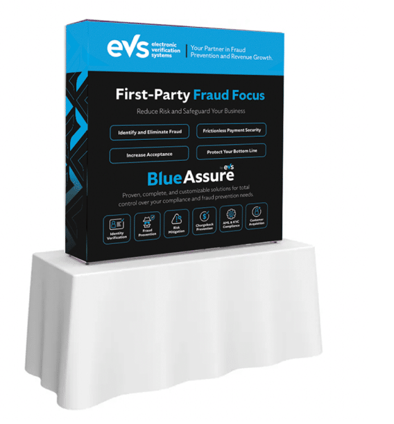
Trade show, collateral and other finishing touches
The EVS team is on the road frequently, connecting with clients and potential customers at a diverse array of trade and industry shows across the country. We needed to make sure they had a booth and materials that presented EVS as the forward-thinking business that it is. So, we designed a new trade show booth along with brochures, product sheets, and other collateral, all with the new brand identity, positioning, and nomenclature. With one streamlined, modern look across all its materials and digital presence, EVS now had an identity that truly reflected its brand promise: a seamless experience across all touchpoints from a proven partner that has earned the highest level of trust over 25 years.